Played around with colors, textures and lights. Still very unhappy with the king, but hey... If it was easy it wouldn't be worth doing.

Played around with colors, textures and lights. Still very unhappy with the king, but hey... If it was easy it wouldn't be worth doing.

Congratulations ! Very nice. One comment about the queen: maybe queen's face could be more abstract. Perhaps removing the facial circle might work better?

It's not my kind of set (i like a very essential design for chess pieces), but that doesn't stop me from noticing that it's actually a very nice set.
I agree with you on the fact that the king is the weakest part of the design right now, it's not bad in itself but just doesn't look like it's part of the same set (very massive compared to the other pieces, which are ligth and elegant). It also doesn't look particularly like a king (i fear that after one century of staunton design you really can't call it a king anymore without the classical cross on the top).
The knight is also still a bit unconvincing to me, for the opposite reason. It's very thin and frail looking; it just looks like a weak piece. The design is ok but it has to get much "fatter" imho. This is important since the knight is the piece with the most flexible design in a staunton style set (while rooks, for example, are more or less always the same), so it's the very first piece everybody will look at when judging the whole set.
Also, in case you don't know, you're designing an english-speaking board by making the bishop look like a "bishop". In Italy the bishop is actually the "standard-bearer", in France it's the "fool", in Germany it's a "runner". This is not an issue of course, but i just wanted to make sure that you know why not everywhere people will understand why your bishop looks like...a bishop :P

so basically you are too much of a weenie to produce the chess set but figured, 'hey i can go on chess.com and show off my chess set and get compliments and feel good about myself'

bresando wrote:
" Also, in case you don't know, you're designing an english-speaking board by making the bishop look like a "bishop". In Italy the bishop is actually the "standard-bearer", in France it's the "fool", in Germany it's a "runner". This is not an issue of course, but i just wanted to make sure that you know why not everywhere people will understand why your bishop looks like...a bishop :P"
Yes and in the east the bishop is the elephant but this is closest to the Staunton design which is standard. And in the Staunton design the bishop represents an actual bishop
LoveMagnet, please ignore the trolls and thanks for sharing your designs and ideas
bresando wrote:
" Also, in case you don't know, you're designing an english-speaking board by making the bishop look like a "bishop". In Italy the bishop is actually the "standard-bearer", in France it's the "fool", in Germany it's a "runner". This is not an issue of course, but i just wanted to make sure that you know why not everywhere people will understand why your bishop looks like...a bishop :P"
Yes and in the east the bishop is the elephant but this is closest to the Staunton design which is standard. And in the Staunton design the bishop represents an actual bishop
You know, it will sound very stupid but I never realized before that the staunton bishop looked like an actual bishop. It's so abstract that i bet most of the people in my club probably think that the "alfiere" (italian for bishop-chess piece; the proper bishop is called "vescovo") just has a random abstract design without a particular meaning. Anyway, you have a point, the bishop does normally look like a bishop :P So let's just say that some non english speakers will be slightly surprised by lovemagnet's very "religious" bishop, realizing for the first time what the standard staunton bishop represents. This is not a bad thing in itself of course.

Very nice designs.
I haven't read through all the replys however, these are my thoughts (based on the original pics at start of thread):
1. The aesthetics of the designs are very good indeed. Clean, sleek and stylish.
2. K and Q : perhaps vary the crowns, only slightly, to distinguish between the two a little easier - say just a few less spikes or somthing.
2. Knights are the right height however, not enough bulk in the head.
3. Bishops, perhaps elongate the middle section only to make fractionally shorter than the Q - but not to lose girth. The balance of the base and head are however perfect.
4. The pawns are absolutely perfect. Very nice indeed.
Obviously, a small weighted cavity in each (dependant on the final material used) with felted or cloth base.
Certainly something I'd consider buying.
Very very good stuff.
Wayne
@bresando. You're right. It is pretty abstract. It occurred to me when I was a teen and watching the Pope on Christmas day with a chess set in front of me. Well still not 100% sure but given that Staunton design originated in London, I think it is a bishop's ceremonial hat

here ya go bud! upload your design, set up your store and sell them tomorrow! I am going to get my butt in gear and start on my 3d design so i can do the same! They already have a few nice sets available already. Whats cool is your customer can choose what material to have it printed in :)

its great work. Since you're asking, I'll give you my 2 cents. 1. I find the bishop's praying hands distracting. They look like moustaches, and then I realize they're hands in prayer, and I've been distracted by them. For some reason I'm not distracted by the king's or queen's hands. 2. I actually like the king and queen as is, I love their whimsical-ness (word?). 3. Here is my biggest criticism. Although I love the design of the pawns I think they don't fit with this particular set of pieces. I'd keep this design of pawns for another set, and I'd redesign the pawns for this set, with a pawn base that is closer to the base on the king queen and bishop. I just find the radical difference in the pawn base distracting. These pawns look a little like a playing piece in monopoly or one of those board games...they are too flakey for this set, and this is defnintely not a flakey set. 4. I love your rook and your knight. Great work.
btw I think the second version of the king and queen is much better. The first version was far too pointy. And I just read that you 'hate' the king. Don't! The new king is awesome, and the new queen is awesome.
and then I realize that you're asking should you put these into production, not asking for feedback on the design! Ah well, we've been giving you all kinds of feedback. I have no knowledge of the business end of making chess pieces. But I'd definitely encourage you to go with weighted plastic (resin, same thing I think...altho its not my field at all. 3d printers? Can they be rented these days?)
and, uh, chesshole sure gave himself an appropriate name.
ph I just saw someone posted a site for 3d printing. Awesome.
Thanks for all the comments. Feedback on the design is very welcome. Especially the constructive stuff ;-)
Shapeways.com was my first thought. It would be very easy to get the set "into production" by simply uploading it to there. However when you look at some closeups of 3D printed items, then you see that they have a "grainy" quality to them. Also I think the price of a 3D print is very high.
I could use it as a base to create a mold from. However with all the nooks and crannies in the shapes, it will have to be some sort of flexible mold in order to make it possible to get the elements out after curing, and I'm not sure how long such a mold will last. I don't think it is really suited for mass production.
In any case if I had to do manual work on each and every set, like molding and spray painting, then I am quickly going to look at a pretty low hourly rate. On the other hand if I "outsource" the production to China, then I am probably going to see a million sets on sale, which I never ordered and which I don't get a penny for. That may happen no matter how I proceed though.
Ahh... So many if's and maybes. That's why I need to consult with someone with industry experience.
i disagree I think this looks good for $140 bucks http://www.shapeways.com/model/195224/typographical-chess-set.html?li=search-results&materialId=6... and whats nice is you could have it made in silver,stainless steel, or brass too, which obviously could not be grainy, id go this way and test the market before trying anything overseas.
PS latex molds are quite durable, and you could always make another one its only like $20
Good Luck!
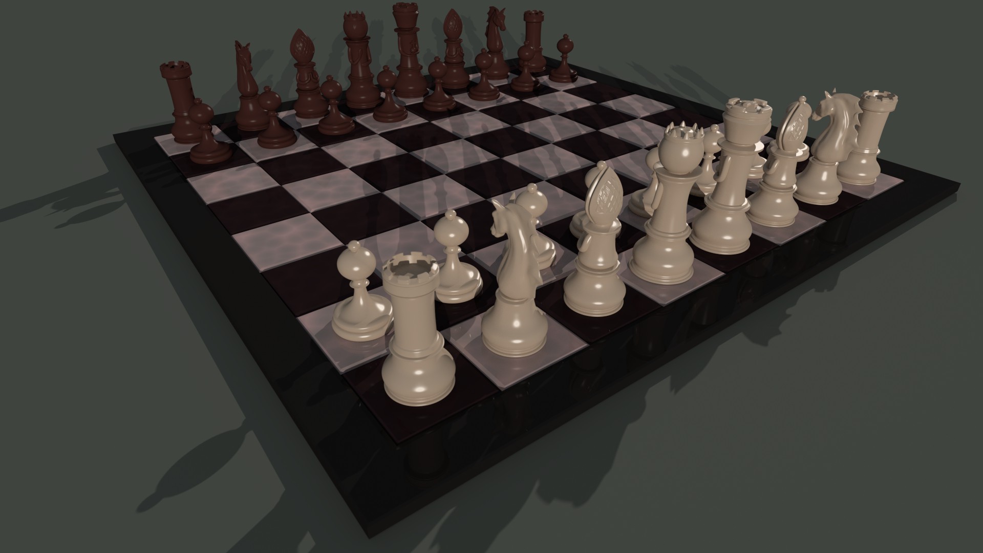
Colors is a tricky subject. A classical chess set is kept in black and white (hence the names "black" and "white" for the two sides), but as one mentioned earlier the contrast is pretty harsh.
It seems to me that the choices are black/white and various shades of grey, red/off white in different shades more or less tinted towards brown, and blue/off white in different shades. For some reason green is not very popular, and I wouldn't want a green chess set myself.
For some reason brown is very popular, which is why I made a brown set for you guys. However I wouldn't want that color myself, so I made some renderings with a grayish dark blue color for the black pieces.
By making the texture more diffuse, the highlights get bigger, revealing more details on the black pieces. It also makes the material look more plasticy (if that is a word). Since it is likely that the final material IS going to be plastic, this may be a more "honest" representation of the pieces after all.
What I don't like about the king is that the head is a rather unshapely lump, fused with this over sized crown. The piece looks top heavy to me. I'm considering starting over with it and try again.


I've bee thinking a lot about all the comments about the knight needing to be a bit more bulky. I think that they may be a result of some pictures where you see the piece from the front. If you do a picture search on google for "chess pieces", most of the pictures of knights are taken from the side, but in reality a typical knight is actually a rather slender piece, seen from the front.
The thing is that you can't simply scale the piece up in the direction of the width, and then it will be "better". A horse has some specific proportions (i used a number of photographs of horses for reference when modeling the piece), and when you deviate too much from those it stops looking like a horse.
I found a picture of a typical Staunton knight shot from different angles, and as a comparison I replicated the shot with my own piece.
Are you REALLY sure the proportions are off?


In my personal opinion the Bishops and the Rooks are some of the very nicest I have seen. Great work! The Knight is looking much better than it did in the original pictures as well. I hope you can find interested parties. It would be a beautiful set to own.